
In the bustling aisles of an Indian supermarket or a local kirana store, your product has only a few seconds to grab a customer’s attention. Amidst a sea of competitors, what makes a buyer choose your brand? Often, it’s the packaging. More specifically, it’s the power of typography—the art of using fonts to communicate your brand’s story, quality, and promise.
For FMCG brands, food manufacturers, agro-businesses, and pharmaceutical companies across India, typography isn’t just about aesthetics; it’s a critical business tool. As a leading packaging supplier in Kolkata, Tirupati Traders understands that the right font can build trust, create desire, and ultimately, drive sales.
Why Typography is the Soul of Your Brand Identity
Think of typography as your brand’s voice. It sets the tone before a single word of your product description is read. A carefully selected font is crucial because it can instantly convey your brand’s personality and values. For instance, a brand like Zaha Atta might use a bold, traditional font on its premium atta packaging pouch to evoke feelings of homemade goodness and trust.
The visual language of fonts works on a subconscious level:
- Elegant Serif Fonts: These classic fonts with small decorative strokes (like Times New Roman) suggest tradition, reliability, and premium quality. They are often used for high-end food products, such as artisanal teas or premium dry fruits, creating a sense of heritage and luxury.
- Modern Sans-Serif Fonts: Clean, straightforward, and without decorative strokes (like Arial or Helvetica), these fonts signal modernity, efficiency, and clarity. They are perfect for health products, detergents, or any brand that wants to appear straightforward and innovative, as seen on many detergent powder packets.
- Playful Script Fonts: Fonts that mimic handwriting add a personal, friendly, or artisanal touch. These are excellent for snacks, confectionery, or organic products, helping to create an emotional connection with the customer and suggest the product is made with care.
Maintaining brand consistency through typography is vital. When the font on your spice powder laminated pouch matches the font on your website and advertisements, you build brand recognition and customer loyalty over time.
Packaging Typography: Making Your Product Shine on the Shelf
On a physical product, typography does the heavy lifting. It has to be clear, attractive, and persuasive. This is especially true for flexible packaging like plastic pouches, where design and print quality are paramount. Many business owners ask us for tips on choosing the right font for their packaging. The key is to balance aesthetics with functionality.
Creating a Clear Visual Hierarchy
Your packaging needs to communicate key information quickly. Use typography to create a hierarchy:
- Product Name: This should be the most prominent text, using a bold or larger font to be instantly identifiable. It establishes the product’s identity and is the first thing a customer’s eye is drawn to.
- Key Benefits: Information like “New & Improved,” “Organic,” or “Extra Strong” should stand out. Using a different weight, colour, or font style can highlight these selling points without cluttering the design.
- Brand Name: While the product name is key, your brand logo and name should be clearly visible to build long-term recognition. Consistent placement and font usage across your product line, like on a three-layer laminated pouch, reinforce brand identity.
One of the biggest typography pitfalls to avoid is poor readability. Overly decorative or complex fonts can confuse customers and make your product look unprofessional. Always test your font choices on a mock-up of the packaging to ensure they are legible from a typical viewing distance.
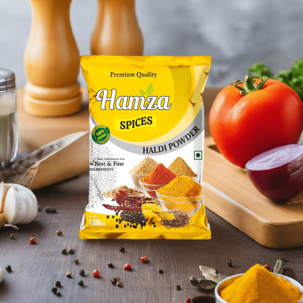
Case Study: How Hamza Spices Spiced Up Their Sales
A great example of typography in action is our client, Hamza Spices. They wanted to refresh their packaging to appeal to both traditional and modern home cooks. By working with a custom printed pouch manufacturer like us, they redesigned their packaging. They chose a bold, clean font for the spice name (e.g., “Turmeric Powder”) for immediate clarity and paired it with an elegant, slightly traditional font for their brand name. This combination on their two-layer laminated pouches communicated both authenticity and high quality, leading to increased shelf appeal and better brand recognition.
Let Tirupati Traders Be Your Partner in Packaging Excellence
Choosing the right font is just the beginning. To bring your vision to life, you need a reliable laminated pouch maker who ensures your designs are printed with precision and vibrancy. At Tirupati Traders, we specialise in high-quality, custom-printed packaging solutions that help your brand’s typography truly stand out.
Whether you need professional typography for pharma products, elegant designs for food packaging, or bold fonts for FMCG goods, we have the expertise to deliver.
Our diverse range of products includes:
- Food & Agro Packaging: From Wheat Atta Packaging Pouches to moisture-proof Printed Tea Pouches, we ensure your typography reflects the freshness and quality within.
- Consumer Goods Packaging: We provide durable Detergent Packaging Pouches and hygienic Printed Sanitary Pad Pouches where clarity and trust are paramount.
- Specialty Product Packaging: Showcase your unique products with solutions like our Premium Printed Khaini Pouches or secure Tobacco Packaging Zipper Pouches.
Let’s work together to create packaging that speaks volumes about your brand. Contact Tirupati Traders today to discuss how our expert packaging solutions can elevate your brand’s identity.