In India, tea is not just a morning beverage; it is an emotion, a daily ritual, and a staple in every household. But when a consumer walks down a crowded supermarket aisle or visits the local kirana store, what makes them pick one packet over another? As the old business adage goes, “Jo dikhta hai, woh bikta hai” (What is seen, sells). Packaging design goes far beyond mere aesthetics; it acts as your brand’s silent salesman, directly shaping consumer perception and driving B2B and B2C sales.
By understanding the deep psychological impact of visual hues, food manufacturers and FMCG businesses can craft custom packaging that resonates emotionally with their exact target audience. In a fiercely competitive market, the strategic use of packaging shades helps differentiate premium brands, communicates product authenticity, and heavily influences purchasing decisions.
The Science Behind Visual Hues and Consumer Behavior
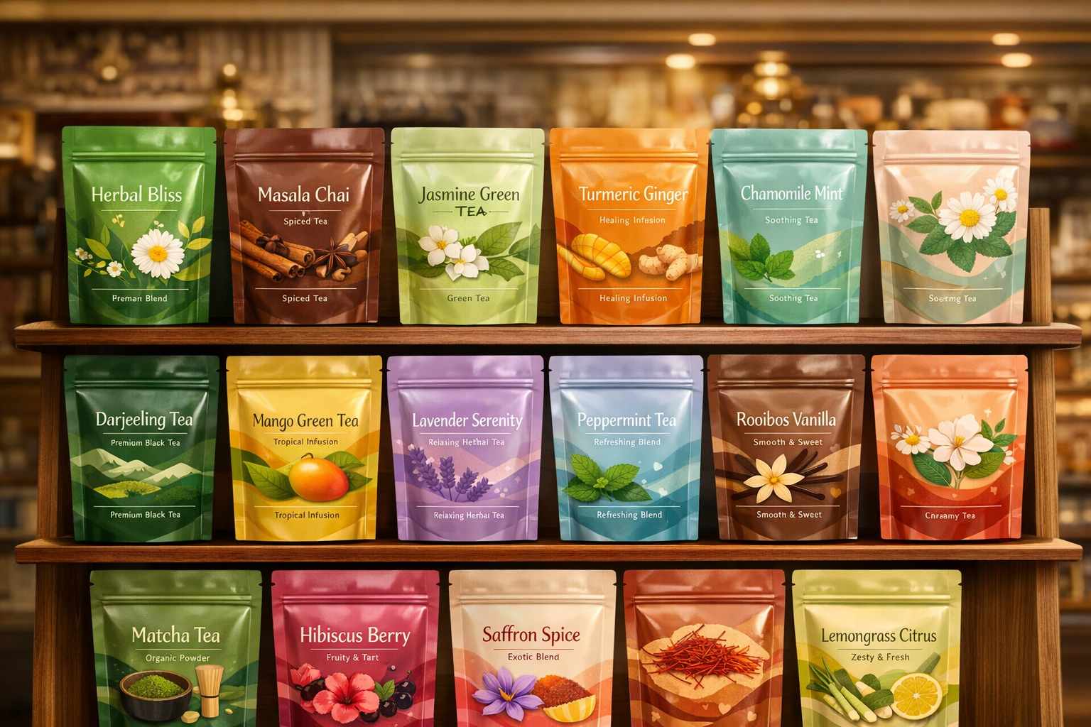
The study of visual psychology explores how different tones trigger human emotions and drive split-second buying choices. Every shade carries a specific cultural and psychological weight. For instance, green is universally tied to wellness, nature, and Ayurveda, making it perfect for herbal blends. Yellow radiates happiness and youthful energy. In the Indian context, a deep, rich red often symbolizes warmth, passion, and the bold flavor of a kadak masala chai, while cooler tones might evoke a sense of calm and refreshment.
Industry research confirms that over 85% of shoppers cite visual appearance as the primary factor when trying a new product. Warm, earthy tones can subconsciously make a blend feel more robust and comforting, while crisp blues and whites suggest purity and freshness. These emotional triggers dictate first impressions, subtly convincing buyers of the product’s premium quality, taste, and reliability before the pack is even opened.
Defining Brand Identity Through Thoughtful Design
For agro companies, food manufacturers, and tea enterprises, visual branding is an invaluable asset. Consistent and strategic color choices reflect your company’s core values and instantly connect with your ideal demographic. High-end luxury blends frequently lean on sophisticated palettes like rich burgundy, matte black, or metallic gold to project an aura of exclusivity and premium quality.
Conversely, wellness and organic ranges utilize muted greens, earthy browns, and soft beiges to emphasize natural ingredients and health benefits. For fruit-infused or iced varieties, popping shades like magenta or vibrant orange bring a sense of fun and intense flavor. Maintaining color consistency across your product line builds unwavering consumer trust and ensures instant brand recognition on any crowded shelf.
Having partnered with distinguished brands like Steps Tea, Aanchal Gold, Vizesa Tea, and Mahan, we at Tirupati Traders understand exactly what B2B clients need. We know that secondary design elements—such as crisp typography, high-quality plastic pouch finishes, and culturally relevant imagery—must work seamlessly with your chosen palette to create a memorable and highly marketable product.
Consumer Perception and Impulse Purchasing
Shelf appeal is everything in fast-moving consumer goods. The exterior look of a stand-up pouch sends immediate, subconscious signals regarding the freshness, flavor profile, and health benefits of the contents inside. For example, a sleek black pouch instantly implies a strong, traditional orthodox blend, while a bright matcha green appeals directly to modern, health-conscious millennials.
These psychological responses are powerful drivers of impulse buys. Warm, inviting tones offer a sense of homely comfort, whereas cool shades promise a rejuvenating experience. Furthermore, demographic factors such as age and regional background strongly influence these preferences. Even the slightest adjustment in a hue’s saturation can completely revitalize a product’s market image, making high-quality printing services absolutely critical for FMCG success.
Modern Trends in B2B Packaging Solutions
As consumer preferences evolve, so do the trends dominating the packaging industry. Today’s buyers appreciate authenticity and sustainability.
- Minimalist & Clean Aesthetics: Neutral tones paired with generous whitespace are highly favored by modern consumers looking for straightforward, unpretentious quality.
- Eco-Conscious Palettes: Soft greens, warm beiges, and kraft-inspired colors are trending heavily, signaling to environmentally aware buyers that the brand values sustainability.
- Dynamic Gradients: Holographic finishes and vibrant color transitions are incredibly effective for capturing the attention of younger, Gen-Z demographics.
- Regional Sensibilities: While subtle, sophisticated tones perform exceptionally well in premium urban markets, bold and vibrant colors continue to rule the heart of regional and tier-2 Indian markets.
Practical Application Strategies for FMCG and Food Manufacturers
To truly leverage the psychology of aesthetics, businesses must adopt actionable, research-backed strategies for their packaging:
- Understand Your Audience: Invest time in understanding local preferences, cultural associations, and what your target demographic truly values.
- Implement Intuitive Color Coding: Differentiate your product lines effortlessly. Use earthy greens for organic leaves, vibrant reds for strong CTC blends, and calming pastels for chamomile or green teas.
- Prioritize Legibility: Aesthetics should never compromise functionality. Ensure that all vital nutritional information, FSSAI logos, and branding text are crystal clear against the background.
- Partner with Trusted Manufacturers: A design is only as good as its execution. Collaborating with a reliable manufacturer ensures your colors pop perfectly on durable, moisture-resistant materials.
Using top-tier, food-grade materials ensures that the vibrant look of your brand does not fade, whilst actively protecting the aroma and freshness of the agro-products inside.
How Poojn.in Can Help with The Psychology of Color in Tea Pouch Design
At Poojn, we deeply understand the importance of color psychology in tea pouch design. Colors play a highly significant role in influencing consumer choices, as they evoke immediate emotions and establish strong brand perceptions. Our unmatched expertise in custom, high-quality plastic pouch packaging ensures your products stand out dominantly on shelves while perfectly aligning with your brand’s unique identity.
Why Choose Poojn for Your Custom Pouch Design?
- Custom Designs: We offer tailored, B2B-focused solutions to meet your exact specifications, ensuring the visual scheme of your pouches aligns flawlessly with your brand and target audience preferences.
- High-Quality Material: Our pouches are manufactured from highly durable, food-grade materials that lock in the freshness and aroma of your products while showcasing vibrant, eye-catching colors effectively.
- Expert Branding: With our dedicated team, you can craft a packaging strategy that actively uses psychological triggers to attract new customers and build unshakable brand loyalty.
Featured Products for Premium Beverage Packaging:
- Tea Packaging Zipper Pouch – Freshness Sealed Premium Branding
- Premium Tea Packaging Pouch – Freshness Sealed Custom Printed
How to Get Started
Contact us today at +91 7003213441 to discuss your specific B2B packaging needs. Our professional team will help you engineer solutions that not only preserve the pristine quality of your goods but also utilize visual psychology to heavily appeal to your end consumers.
By choosing Poojn, you guarantee that your product’s exterior makes a powerful, lasting impression and consistently drives consumer engagement.
Frequently Asked Questions on Packaging Psychology
How do visual aesthetics impact consumer choices in retail packaging?
Visual elements instantly influence human emotions and subconscious perceptions. Specific shades can make shoppers feel energized, relaxed, or sense premium luxury, directly pushing them toward a purchase decision.
Which shades are most effective for beverage and grocery packaging?
Earthy tones, lush greens, and warm, inviting hues are incredibly popular because they organically represent health, freshness, and vitality. However, the ultimate choice always depends on the specific product variant and the demographic you are targeting.
Why is strong branding so crucial in custom pouch manufacturing?
Branding creates immediate market recognition and fosters consumer trust. The correct combination of hues and structural design allows your product to dominate retail shelves while clearly communicating your company’s commitment to quality.
Can the exterior look alter how buyers perceive product quality?
Absolutely. Visual cues heavily shape the perceived value of a product. For example, subtle gold foiling or deep matte blacks immediately suggest high-end luxury, whereas clean pastel tones project an image of pure, organic goodness.
Are vibrant palettes always better for grabbing retail attention?
While bright shades naturally draw the eye, they must align with your product’s core identity. Vivid colors are fantastic for energetic, spicy, or fruity blends, but softer, muted tones are much more effective for calming or health-focused botanical products.
How can the design visually communicate the flavor profile?
Colors act as a visual shortcut for taste. Rich reds indicate strong or spicy notes, while cool blues and greens suggest minty, herbal, or refreshing blends. This immediate visual communication helps buyers intuitively understand what they are purchasing.
Does cultural background affect how packaging is perceived?
Yes, cultural nuances are vital. A color that signifies celebration in India might mean something entirely different elsewhere. Understanding regional preferences ensures that your packaging resonates positively with local sentiments and traditional values.
Can leveraging these psychological insights actually increase B2B and retail sales?
Without a doubt. Implementing the right visual strategies in your packaging triggers positive emotional responses, establishes profound brand trust, and consistently persuades consumers to choose your product over competitors.