In India, tea is far more than just a morning beverage; it is an emotion, a daily ritual, and a symbol of hospitality. For FMCG brands, food manufacturers, and agro businesses entering this highly competitive market, shelf presence is everything. Clean and elegant packaging designs have emerged as a powerful way to communicate authenticity, premium quality, and mindfulness. By blending simplicity with sophistication, modern brands can create a lasting impression on consumers.
As a leading plastic pouch and packaging pouch manufacturer based in Kolkata, Tirupati Traders understands the pulse of the Indian B2B market. We know that an uncluttered, modern layout helps brands communicate their core message effectively while significantly boosting the perceived value of the product.
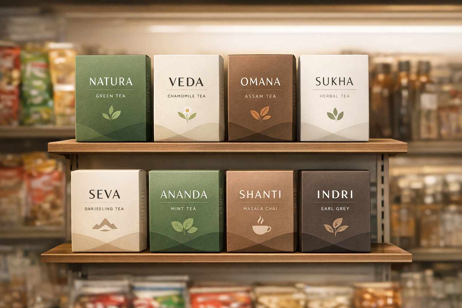
The Fundamentals of Clean Text Layouts in Packaging
Using a simplified text approach means relying on clean fonts and strategic white space to prioritize readability and elegance. Whether you are selling a robust Assam CTC or a delicate Darjeeling green tea, the goal is to maintain perfect visual balance without overshadowing your unique brand identity.
- Font Hierarchy: Larger fonts should immediately draw attention to the tea variety, while smaller, legible text can handle secondary information like sourcing details and brewing instructions.
- Generous Spacing: Embracing white space ensures your core message stands out, making the pouch look highly professional and easy to read.
- Earthy and Neutral Colors: While neutral tones usually dominate these layouts, adding a subtle touch of your brand’s primary color introduces personality without causing visual clutter.
- Instant Legibility: In the fast-paced retail environment, simple designs are inherently viewed as premium and trustworthy—a critical advantage in the FMCG sector.
Why Simple, Uncluttered Designs Work for the Indian Tea Market
A clutter-free visual approach aligns naturally with the calming, mindful experience of sipping a hot cup of chai. This aesthetic not only elevates the product’s perceived value but also strongly resonates with today’s environmentally conscious buyers.
Cultural Connection: Simple packaging reflects the purity, tradition, and soothing nature deeply embedded in tea-drinking cultures worldwide.
Maximum Retail Visibility: Supermarket shelves are often chaotic and loud. A clean, elegantly designed pouch naturally catches the eye by offering a refreshing break from visual overload.
Eco-Friendly Messaging: Minimal designs often require fewer heavy inks and printing resources, perfectly complementing sustainable business practices.
Focused Storytelling: By removing distractions, brands can highlight what truly matters, such as artisanal craftsmanship, organic origins, or health benefits.
Essential Rules for Functional and Elegant Pouch Design
To craft packaging that is both beautiful and highly practical for wholesale and retail distribution, FMCG brands should follow a few core guidelines:
Strategic Contrast: Ensuring high contrast between your text and the pouch background guarantees flawless readability, even under harsh store lighting.
Perfect Proportions: It is crucial to balance your text size with logos and other graphic elements so nothing feels out of place.
Focusing on the Essentials: Keep the spotlight on the tea type, distinct flavor notes, and origin. Eliminate unnecessary fluff that might confuse the buyer.
Adaptability Across Sizes: Your chosen typography must look just as stunning on a small 50g sample packet as it does on a bulky 1kg wholesale bag.
Trusted by the Best: Delivering Excellence in Every Pouch
At Tirupati Traders, we pride ourselves on delivering top-tier custom plastic packaging solutions tailored for the unique needs of the food and beverage industry. Our commitment to dependable service and unmatched clarity in printing has made us the go-to partner for numerous esteemed businesses.
We have proudly crafted high-quality packaging for renowned tea brands such as Steps Tea, Aanchal Gold, Vizesa Tea, and Mahan. Whether it’s a robust printed laminated pouch or a moisture-resistant zipper packet, our Kolkata-based manufacturing facility ensures your brand’s sleek typography is printed with absolute precision, helping your product shine in any retail setting.
The Critical Role of Readability in Food Packaging
When dealing with FMCG and agro products, readability isn’t just about aesthetics; it’s about compliance and consumer trust.
Clear Character Distinction: Always select fonts with distinct lettering to prevent any misinterpretation of crucial details.
FSSAI and Regulatory Compliance: Mandatory details like ingredients, nutritional facts, and FSSAI certifications must be crystal clear and legally compliant without disrupting the overall sleek design.
Universal Accessibility: Utilizing appropriate font scales and sharp contrasts ensures that every consumer, including older demographics with visual challenges, can easily read your packet.
How Poojn.in Can Help with Minimalist Typography in Tea Packaging: Clean and Elegant
Minimalist typography in tea packaging focuses on clean design and elegant appeal. Poojn.in specializes in creating custom, high-quality plastic pouch packaging that aligns with these exact principles. Our deep industry expertise ensures that your tea packaging stands out with a sleek, professional look while maintaining maximum functionality and durability.
Benefits of Choosing Poojn.in for Your Next Packaging Project:
- Customizable Designs: We help FMCG brands create packaging that beautifully highlights minimalist typography using clean fonts and highly effective layouts.
- Durable Material: Our premium plastic pouches are entirely moisture-proof, guaranteeing the long-lasting freshness and aroma of your tea.
- High-Quality Printing: Leveraging state-of-the-art printing technology, we ensure your text remains sharp, precise, and visually striking.
- Eco-Friendly Options: We proudly offer sustainable material choices for modern brands prioritizing environmentally friendly packaging solutions.
- Enhanced Brand Identity: A sleek, uncluttered text layout significantly boosts your brand’s premium image and maximizes shelf appeal.
Explore Our Related Premium Products:
- High-Quality Tea Packaging Pouch – Secure & Stylish Storage
- Printed Tea Pouch – Moisture-Proof, Durable & Customizable Packaging
For B2B bulk inquiries, wholesale pricing, or custom design consultations, connect with our team via WhatsApp at +91 7003213441 or visit Poojn.in to learn more about how we can elevate your brand.
Frequently Asked Questions
What is minimalist typography in tea packaging?
This design approach focuses heavily on clean, simple fonts accompanied by ample spacing. It intentionally avoids visual clutter, using design elements very sparingly to put the spotlight directly on the brand name and essential product information.
Why is this specific style so effective for the tea market?
It naturally creates a highly modern and elegant appeal. This simplicity significantly enhances readability, helping everyday customers quickly identify key details and making the overall shopping experience much more user-friendly.
What types of fonts generally work best for this kind of packaging?
Sans-serif fonts are widely preferred because they look incredibly clean and are effortless to read. Fonts featuring thin strokes and uniform spacing beautifully complement a sleek, uncluttered design language.
How does a simplified layout actually improve readability?
By strictly utilizing clean fonts, generous spacing, and eliminating chaotic background details, the core information becomes exceptionally easy to scan—even when a customer is looking at the product from a distance on a supermarket shelf.
Why is an elegant aesthetic so crucial in food and beverage packaging?
An elegant, well-thought-out design instantly creates a premium feel, which naturally attracts quality-conscious buyers. A refined text layout amplifies this appeal by keeping the presentation highly professional and trustworthy.
Can this clean design style work for deeply traditional Indian brands?
Absolutely. Simple design principles are highly adaptable. Whether an FMCG brand leans towards a heritage look or a hyper-modern vibe, a clean text layout can dramatically enhance the packet’s look while staying completely true to the company’s roots.
What role do colors play when using simple text designs?
Neutral, earthy, or soft pastel colors typically pair flawlessly with a refined text layout. The chosen color palette should always complement the font style, elevating the calm, organized aesthetic of the pouch.
How does this packaging strategy impact long-term brand recognition?
Consistent and clear typography is the foundation of a strong visual identity. Consumers can easily recognize and recall a brand that communicates clearly, which ultimately builds deep-rooted brand loyalty and recurring sales.