In the bustling markets of India, your product’s packaging is often its first handshake with the customer. It needs to do more than just protect the contents; it needs to tell a story, evoke a feeling, and build an instant connection. For brands in the FMCG, food, agro, and pharma sectors, especially those aiming to convey a sense of peace, wellness, or spirituality, the choice of colours is paramount. This guide explores how your business can leverage calming and spiritual colour palettes to create packaging that not only stands out but also resonates deeply with the Indian consumer.
The Unspoken Language: Understanding Colour Psychology in Packaging
Colours speak directly to our emotions, influencing perceptions and purchasing decisions long before we read the text on a packet. As a leading packaging supplier in Kolkata, we’ve seen firsthand how a thoughtful colour strategy can transform a product’s appeal. Certain hues carry powerful associations that can be harnessed for your brand.
- Soothing Blues: Often associated with trust, serenity, and reliability, shades of blue are perfect for products related to health, wellness, and hygiene. Think of packaging for pure water, calming teas, or even gentle detergent powders that promise a clean, fresh start. A soft sky blue can create a sense of calm, while a deeper navy can convey professionalism and expertise.
- Earthy Greens: Green is the colour of nature, balance, and renewal, making it a natural choice for organic, herbal, and eco-friendly products. From packaging for Ayurvedic remedies to farm-fresh pulses and spices, this colour communicates health and harmony. Using gradients of green can mimic lush landscapes, reinforcing a product’s natural origins.
- Mindful Lavender and Purples: These shades are deeply connected to spirituality, mindfulness, and relaxation. They are frequently used for products like incense sticks, aromatherapy oils, and self-care items such as sanitary pad pouches that promote comfort and well-being. A hint of lavender can elevate a product, giving it a premium and serene feel.
Crafting Harmony: Key Elements of a Calming Packaging Design
Creating a truly spiritual or calming packaging design is about more than just picking a single colour; it’s about building a harmonious palette. Many businesses wonder if combining multiple colours can still maintain a calm vibe. The answer is a resounding yes, provided the tones are complementary and balanced. The key is to focus on subtlety and cohesion.
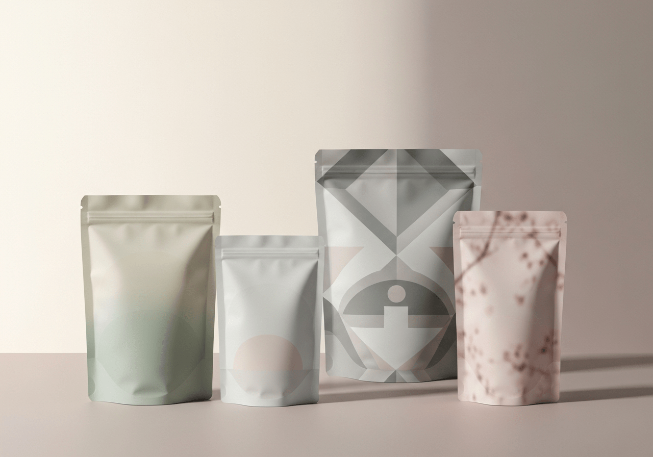
- Embrace Muted & Earthy Tones: Instead of bright, jarring colours, opt for soft pastels, dusty pinks, light sage, terracotta, and beige. These shades are easy on the eyes and evoke a powerful connection to nature and simplicity. They create a relaxed, inviting feel that draws customers in without overwhelming them. This approach works wonderfully for premium food products like packaged spices.
- Use Natural Gradients and Textures: Smooth colour transitions that mimic a serene sunset, gentle ocean waves, or the morning sky add depth and a dynamic sense of peace. You can further enhance this effect by choosing the right material finish. A matte or frosted texture on a laminated pouch feels more organic and calming than a high-gloss surface.
- Incorporate Elegant Metallic Accents: A touch of gold, silver, or rose gold can bring a sense of elegance and divinity to your packaging without being loud. These metallic finishes work beautifully as highlights for logos or intricate patterns, adding a premium feel that signifies quality and care, especially for festive or special edition products.
- Leverage the Power of White Space: Never underestimate the role of clean, uncluttered design. White space (or negative space) is crucial in creating a calm and spiritual feel. It allows the key design elements and colours to breathe, preventing the packaging from looking too busy and reinforcing a message of simplicity and purity.
Design in Action: How Indian Brands Use Spiritual Palettes
The Indian market is rich with examples of brands that masterfully use colour to connect with their audience. The cultural significance of colours here is immense; for example, saffron evokes spirituality, while indigo is linked to tradition. Successful brands understand this and tailor their packaging accordingly.
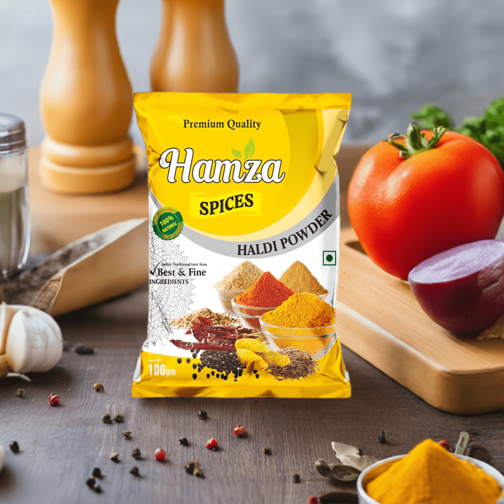
A great example is our work with Hamza Spices. For their haldi powder packaging, we helped them choose a palette centred around warm, earthy yellows and browns. This not only reflects the natural colour of turmeric but also evokes a sense of tradition, purity, and home-cooked meals. The result is a package that feels both authentic and trustworthy on a crowded shelf. This thoughtful approach helps build positive emotions, encouraging customers to associate the brand with quality and care, which ultimately fosters strong brand loyalty.
How to Choose the Right Calming Palette for Your Brand
Selecting the perfect colour palette requires a deep understanding of your brand’s core values and your target audience. Start by defining the primary emotion you want to evoke—is it peace, purity, luxury, or natural wellness? For brands focusing on calm and spiritual themes, lean towards colours that convey trust and mindfulness. It’s often helpful to create mood boards and test different combinations to see which palette feels most harmonious and aligned with your brand’s unique story.
Your Partner in Packaging: Bring Your Vision to Life with Tirupati Traders
Understanding colour theory is one thing; executing it flawlessly on a physical package is another. At Tirupati Traders, we are more than just a laminated pouch maker; we are your partners in creating packaging that tells your brand’s story. Based in Kolkata, we specialize in providing high-quality, custom packaging solutions that bring your vision to life.
Whether you need durable three-layer laminated pouches to preserve freshness or vibrant, custom-printed pouches to capture customer attention, we have the technology and expertise to deliver. Our advanced printing techniques ensure your chosen calming and spiritual colours are rendered with perfect accuracy and vibrancy. We work closely with FMCG brands, food manufacturers, and businesses of all sizes to create packaging that is not only functional but also emotionally resonant.
Ready to elevate your brand with packaging that speaks to the soul? Contact Tirupati Traders today to discuss your requirements and discover how our custom solutions can help your products shine.
The Final Word: Packaging as a Medium for Connection
In today’s market, choosing the right colour palette is a strategic business decision. It is an investment in your brand’s identity and its relationship with your customers. Calming and spiritual colours are not just a design trend; they are a powerful way to communicate values like trust, harmony, and mindfulness.
By embracing thoughtful, serene designs, your packaging can become more than just a container. It can be a source of calm in a customer’s busy day, a symbol of quality they can trust, and a beautiful reflection of your brand’s soul. Invest in a palette that connects, and watch your brand build lasting relationships.