In India, tea isn’t merely a morning beverage; it is a ritual, a moment of solace, and a daily emotion. Whether it’s a strong cup of Assam CTC or a soothing Darjeeling green tea, the experience begins long before the water boils. It starts right at the retail shelf. For FMCG brands, food manufacturers, and agro-businesses, the role of your product wrapper is absolutely critical. Selecting the right design scheme and packaging hues can drastically influence buyer perception and drive those crucial B2B and B2C purchase decisions.
As a leading packaging manufacturer based in Kolkata, Tirupati Traders understands the pulse of the Indian market. We know that creating custom, high-quality plastic pouches is about more than just utility—it’s about crafting a visual story. Let’s dive into how the psychology of colours can transform your tea brand.
Why the Right Visual Aesthetic Matters in B2B & Retail Shelves
Think about the last time you walked down a supermarket aisle. Colour is invariably the first thing that catches the eye. Market research consistently shows that visual appearance heavily dictates consumer buying behaviour. When it comes to a product like tea—which is universally associated with relaxation, warmth, and wellness—your custom printed pouches need to hit the right emotional chords instantly.
Imagine packing a delicate, organic herbal infusion in a harsh, neon-red plastic pouch. It simply creates a disconnect. Consumers looking for detoxifying or soothing blends naturally gravitate towards subtle greens or soft pastels. By leveraging thoughtful design schemes, FMCG brands can build instant brand recognition and unmatched consumer trust.
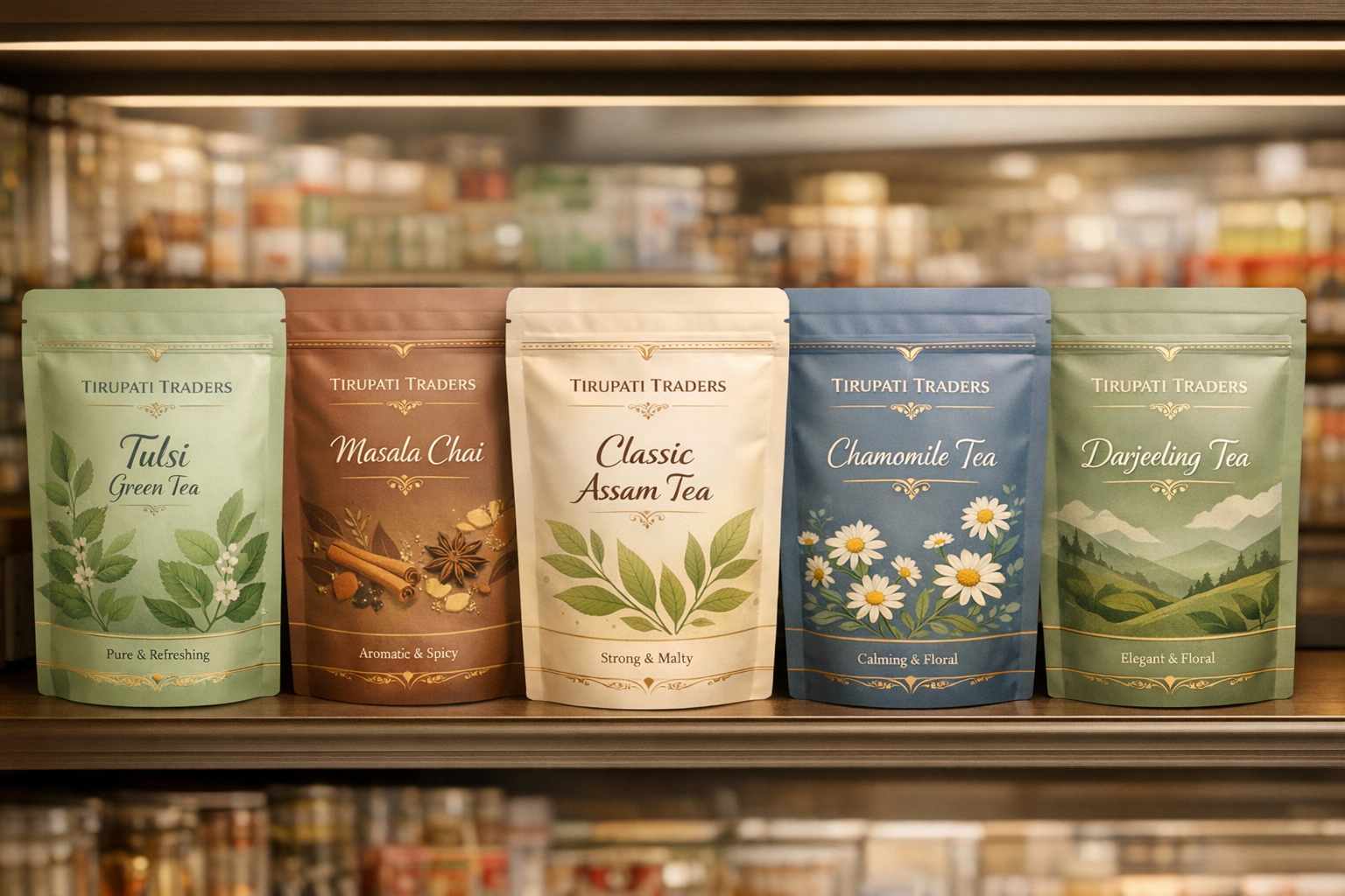
Top Colour Schemes for Custom Printed Pouches
Working with premium brands like Steps Tea, Aanchal Gold, Vizesa Tea, and Mahan, we’ve seen firsthand how specific shades elevate a product’s market presence. Here are the most effective aesthetic directions:
The Botanical Green Aesthetic
Ideal for: Organic blends, Ayurvedic infusions, and pure green teas.
Green inherently symbolizes nature, vitality, and purity. Muted shades like sage, olive, or mint work exceptionally well for detox teas. When paired with earthy brown tones, they give your laminated plastic packaging an authentic, farm-fresh feel that health-conscious consumers adore.
The Serenity Blue Aesthetic
Ideal for: Night-time wellness blends and calming floral teas.
Blue brings a wave of tranquility. Pairing a soft powder blue with crisp white or silver foil accents creates a premium, soothing vibe. It is the perfect choice for chamomile or sleep-time teas, visually promising a restful evening.
The Energizing Citrus Aesthetic
Ideal for: Fruit-infused blends, lemon-ginger teas, and morning boosters.
Bright yellows, oranges, and lively lime greens scream energy. If your agro or FMCG company is launching an invigorating morning blend, these vibrant shades ensure your stand-up zip lock pouches jump off the shelf, communicating instant freshness.
The Earthy Neutral Aesthetic
Ideal for: Traditional black teas, artisanal loose leaves, and premium Assam/Darjeeling blends.
There is an undeniable elegance in simplicity. Taupe, cream, and matte browns ground your product, speaking volumes about craftsmanship. When we manufacture premium tea packaging pouches, adding gold embossed typography to a matte beige background instantly elevates it to a luxury segment.
The Luxury Gold Aesthetic
Ideal for: Festive gifting, corporate hampers, and premium white teas.
In the Indian market, gold is synonymous with prosperity and high quality. Incorporating gold elements against a deep black or stark white background appeals directly to luxury buyers looking for something exclusive.
Beyond the Palette: Elements That Elevate Your FMCG Packaging
While the base shade is your foundation, other elements complete the architecture of your design. At Tirupati Traders, we ensure our B2B B2C packaging solutions are flawless down to the last detail:
- Texture and Finish: A matte finish on a laminated pouch feels sophisticated and modern, whereas a glossy surface makes vibrant colours pop.
- Structural Integrity: B2B clients demand durability. Our moisture-resistant, multi-layered laminated pouches preserve aroma and freshness, crucial for FMCG and agro commodities.
- Typography & Artwork: Elegant serif fonts convey heritage, perfect for legacy tea estates. Hand-drawn botanical illustrations emphasize natural origins.
- Transparent Windows: Adding a clear window to your zipper pouch allows buyers to inspect the leaf quality, instantly boosting authenticity.
How Poojn.in Can Help with Custom Packaging Solutions
Backed by the robust manufacturing capabilities of Kolkata’s Tirupati Traders, Poojn.in specializes in high-quality, customizable plastic pouch packaging that complements your tea brand’s calming and refreshing aesthetic. Choosing the right colours for your product wrappers can create a soothing and premium feel, attracting customers who value tranquility and freshness.
Our durable packaging solutions are designed to align seamlessly with your FMCG branding needs, ensuring your product stands out on retail shelves while evoking the desired consumer emotions. Whether your vision leans towards pastel greens, soft blues, or sophisticated earthy tones, we provide tailored options that bring your ideas to life.
For high-barrier, premium retail presentation, explore these top-tier options:
- Tea Packaging Zipper Pouch – Freshness-Sealed & Premium Branding
- Add to cart for Tea Packaging Zipper Pouch
Our dedicated team at Poojn.in and Tirupati Traders ensures that the packaging not only preserves the delicate freshness and aroma of your tea but also reflects a truly timeless design. For bulk inquiries or custom packaging needs for your agro or food manufacturing business, contact us directly at +91 7003213441.
Crafting Timeless Designs for the Discerning Market
Finalizing the look of your flexible packaging is a strategic business move. Whether you are packing premium dry fruits, spices like our clients at Hamza Spices, or crafting the perfect pouch for a new green tea line, colours have the power to evoke emotions and drive loyalty.
By blending thoughtful hues with reliable, high-quality plastic pouch printing services, you don’t just sell a commodity; you deliver an experience. Let your packaging be as comforting, energizing, or luxurious as the brew inside.
Frequently Asked Questions on Visual Branding for Tea Packets
What are the ideal shades for tea packaging?
Soft greens, earthy browns, tranquil blues, and clean neutral tones are highly effective. These specific shades naturally evoke a sense of the outdoors, calmness, and pure freshness, which perfectly aligns with the relaxing qualities people expect from their daily brew.
How does visual design affect FMCG branding?
The visual tone sets the entire mood for your product before the customer even reads the label. It instantly communicates whether your blend is meant to energize, soothe, or serve as a luxury gift, thereby helping consumers form an immediate emotional connection with your brand.
Which specific hues evoke a sense of calm?
If you are marketing a relaxing blend, lean into shades of light blue, mint green, soft lavender, and pastel tones. These gentle hues inherently reduce visual noise, creating a feeling of tranquility that appeals to wellness-focused buyers.
Are bold and dark colours appropriate for tea packets?
Absolutely. Deep reds, rich blacks, and metallic golds are excellent for specialty or premium loose-leaf segments. They project richness, tradition, and exclusivity. However, it is crucial to balance these strong shades with refined typography to maintain a sophisticated look.
Why do traditional and artisanal brands prefer neutral tones?
Neutral shades like beige, ivory, and soft grey mimic natural materials like kraft paper and unbleached cotton. This gives off an organic, authentic vibe, making it a popular choice for high-quality, unblended products where the focus is entirely on purity.
How can seasonal aesthetics enhance sales?
Introducing seasonal variations—such as warm, spicy orange tones for autumn or crisp, icy blues for winter—keeps your brand feeling fresh and relevant. It creates a sense of limited-edition urgency that can boost short-term B2C retail sales.
Do different varieties of tea require distinct colour codes?
Yes, aligning the wrapper with the contents helps avoid consumer confusion. Green and yellow tones are standard for green teas, while dark reds and browns suit black teas. Herbal and floral infusions benefit greatly from vibrant, ingredient-specific shades like pink or purple.
How do custom packaging pouches impact customer perception?
The correct visual and tactile presentation makes a product feel refreshing, premium, or dependable. High-quality printed plastic pouches not only protect the shelf life but also signal to the buyer that the manufacturer cares about quality, ultimately guiding them to choose your product over competitors.