In the highly competitive Indian FMCG sector, where retail shelves and local kirana stores are packed with options, first impressions matter immensely. For tea manufacturers and B2B brands, custom packaging is much more than a protective layer—it is a silent salesperson. One of the most powerful yet often overlooked elements of this visual strategy is typography. The right typeface does more than just display a name; it grabs attention, reflects your brand’s core identity, and significantly influences consumer purchase behavior. Striking the perfect balance between creative flair and clear functionality ensures your packaging connects deeply with your target audience while communicating vital product details.
The Strategic Role of Typography in Communicating Brand Identity
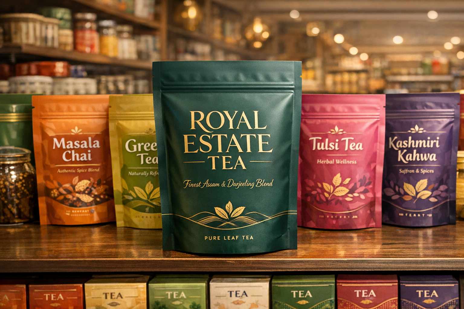
Typography is the foundation of how tea brands express their unique personality. Every font style carries its own emotional weight and cultural resonance, helping brands speak directly to their consumers:
- Serif typefaces: Often associated with heritage and tradition, these fonts are the perfect choice for premium, artisanal, or classic Indian blends like rich Assam or delicate Darjeeling teas. They exude a sense of established trust and sophistication.
- Sans-serif typefaces: Clean, uncluttered, and highly readable, these modern fonts are ideal for wellness teas, green teas, and brands aiming to attract a younger, health-conscious demographic seeking simplicity.
- Custom-designed fonts: For FMCG brands wanting to completely differentiate themselves in a crowded marketplace, custom lettering creates an unforgettable, one-of-a-kind signature look.
Beyond the font family, details such as font weight, letter size, and precise alignment can reflect the very characteristics of the tea itself—be it the bold strength of a morning chai or the soothing delicacy of a chamomile infusion. Maintaining typographic consistency across your packaging, digital presence, and marketing materials is critical for building a cohesive and memorable brand presence. For instance, an organic herbal tea brand might leverage soft, hand-drawn scripts to emphasize purity, whereas a luxury export blend might utilize sleek metallic serif fonts for a premium, high-end aesthetic.
Typography: The Secret Ingredient Behind Exceptional Shelf Appeal
In the fast-paced world of consumer goods, typography is a vital language that bridges the gap between your product and the buyer. Your printed packaging pouch is a canvas that tells your product’s story. Here is why the right text design is a game-changer for B2B brands and food manufacturers:
Typography as the Face of Your Brand
Think of typography as your brand’s trusted ambassador. It conveys values, personality, and even hints at the flavor profile. Whether you opt for timeless serif fonts, minimalist sans-serifs, artisanal handwritten scripts, or bold display fonts for adventurous new blends, the choice directly impacts consumer perception. Furthermore, technical details like kerning (letter spacing) and line height dictate how effortlessly a customer can process your message. A poorly spaced label causes visual friction, while expert typography guides the eye smoothly across your premium plastic pouch.
Making Essential Information Readable Without Compromising Style
Modern tea packaging must relay critical information—such as ingredient lists, FSSAI certifications, brewing instructions, and health benefits—without making the design look cluttered. Achieving this requires strategic typography:
- Optimal Font Sizing: Tiny text gets lost in busy retail environments. Clear, legible font sizes ensure your primary selling points are visible from a distance.
- High-Contrast Designs: Pairing light typography with dark backgrounds (or vice versa) maximizes readability, especially under varying store lighting conditions.
- Visual Hierarchy: Using bold or emphasized fonts helps highlight crucial unique selling propositions (USPs) like “100% Organic” or “Export Quality,” aiding swift consumer decision-making.
- Multilingual Inclusivity: For brands catering to diverse regional markets in India, maintaining stylistic consistency across different languages builds broader trust and accessibility.
In the B2B packaging industry, clarity is non-negotiable. Uncluttered, professional typography ensures your product is perceived as reliable and top-tier.
Storytelling Through Font Choices
Every tea blend has an origin story, and typography is the medium that brings it to life. Vintage-inspired fonts can evoke the nostalgic charm of traditional chai, while playful, whimsical typography might perfectly suit exciting fruit-infused teas. When your packaging’s typography aligns perfectly with the emotion and mood of the beverage inside, it establishes a deep, authentic connection with the consumer.
Emerging Trends in Tea Packaging Typography
Staying updated with industry trends is essential for FMCG brands aiming to remain relevant. Currently, we are seeing a surge in hand-lettered fonts for eco-friendly products, minimalist sans-serif designs for modern wellness blends, and oversized typography that commands attention from the end of a supermarket aisle. Additionally, integrating metallic foil accents with elegant fonts adds a touch of absolute luxury, while geometric typefaces appeal to futuristic, health-tech-focused demographics.
Practical Typography Considerations for Flexible Packaging
For agro, pharma, and food manufacturing companies, practical execution is just as important as aesthetic appeal. Typography must adapt to the physical realities of custom plastic pouch manufacturing:
- Material Behavior: High-quality laminated pouches and plastic films interact differently with ink compared to cardboard. Fonts must be chosen to prevent ink bleeding and ensure crisp edges.
- Advanced Printing Techniques: Techniques like matte finishing or spot UV coating can elevate text, but they require expert typographic planning to avoid visual clutter.
- Regulatory Compliance: FSSAI and organic certifications mandate specific font sizes for nutritional information and manufacturer details.
- Format Scalability: Your typography must remain perfectly legible whether printed on a bulk 1kg zipper pouch or a small sample sachet.
How Poojn.in & Tirupati Traders Can Help with Typography in Tea Packaging: Readability and Style
Typography plays a critical role in tea packaging, influencing how customers perceive your product’s quality and value. At Poojn.in, backed by the manufacturing excellence of Tirupati Traders—Kolkata’s reputable plastic pouch manufacturer—we specialize in creating high-quality custom packaging that ensures your tea dominates the retail shelf. Having partnered with esteemed brands across India such as Mahan, Steps Tea, Vizesa Tea, Aanchal Gold, Hamza Spices, and Zaha Atta, we understand exactly what B2B clients need. Here is how we deliver excellence:
- Customizable Fonts for Branding: We offer packaging solutions with fully customizable typography, enabling FMCG brands to select fonts that perfectly align with their brand identity. Whether you desire bold, elegant, or minimalistic styles, we guarantee the text is visually striking and legible.
- Unwavering Focus on Readability: We prioritize clear communication by utilizing optimal font sizes and crisp typefaces. This guarantees that vital product details—from brewing instructions to ingredient lists—are effortlessly readable for your consumers.
- Durable and Stylish Packaging: Our designs seamlessly blend robust durability with premium style. Using state-of-the-art rotogravure and flexo printing techniques, we ensure your typography maintains its vibrancy and clarity, even in demanding supply chain conditions.
- Premium Tea Packaging Solutions: Food manufacturers and tea businesses looking for top-tier packaging can explore our customized options, including the High-Quality Tea Packaging Pouch from Tirupati Traders. These printed pouches are secure, moisture-resistant, stylish, and provide ample real estate for stunning typography customization.
- Custom Designs Tailored for Tea Brands: We collaborate closely with tea manufacturers to craft packaging that accentuates premium quality. Your typography can be expertly tailored to reflect the true essence of your product, whether it is a traditional robust blend or a modern herbal infusion.
- Eco-Friendly Alternatives: For modern brands prioritizing sustainability, we provide eco-conscious packaging solutions that never compromise on typographic sharpness or visual appeal.
- Expert B2B Guidance and Support: Our dedicated team offers professional advice on typography placement, optimal font selection, and structural design, ensuring your customized plastic pouches are highly functional and aesthetically superior.
For more information on transforming your packaging strategy or to place a bulk order, contact us at +91 7003213441.
Conclusion: Typography That Sells and Tells a Story
Typography in tea packaging is far more than a mere design choice; it is a highly strategic B2B tool that bridges the gap between your manufacturing facility and the end consumer. The right font, strategic spacing, and clear visual hierarchy can transform your custom pouch into a compelling brand asset—capturing attention, establishing authority, and sparking an emotional connection.
Whether you are supplying health-conscious millennials, traditional tea connoisseurs, or adventurous new buyers, thoughtful typography ensures your FMCG product stands out in a crowded market. By balancing distinctive style with flawless readability, you elevate your packaging from a simple container to an unforgettable brand experience. In the fiercely competitive world of retail packaging, every single detail matters. Let exceptional typography be your secret ingredient for market dominance.
Frequently Asked Questions on Typography in Tea Packaging: Enhance Readability and Elevate Style
What role does typography play in tea packaging?
Typography is fundamental in conveying your brand’s unique message, establishing a strong visual identity, and ensuring that essential product information is effortless to read. It subconsciously influences how premium or authentic customers perceive your product to be.
How can typography improve the readability of tea packaging?
By utilizing highly legible fonts, maintaining proper letter spacing, and employing balanced font sizes, you make it significantly easier for consumers to digest product details, FSSAI guidelines, and brewing instructions without visual strain.
What types of fonts work best for tea packaging?
Clean, elegant, and easily scannable fonts yield the best results. Classic serif fonts add a touch of heritage and trust, whereas sans-serif fonts offer a sleek, modern, and uncluttered aesthetic popular with contemporary brands.
Why is font size important in tea packaging design?
Appropriate font sizing ensures that critical selling points like the brand name, flavor profile, and net weight immediately catch the buyer’s eye. Fonts that are too small or excessively decorative can frustrate customers and hurt retail sales.
How can typography elevate the style of tea packaging?
Typography breathes personality into your printed pouches. When thoughtfully paired with your brand’s color palette and layout, specific fonts can make your packaging appear luxurious, rustic, earthy, or cutting-edge, perfectly matching your brand ethos.
What should be avoided when using typography in tea packaging?
It is crucial to avoid mixing too many different font families, using inconsistent text sizes, or relying on heavily decorative styles for essential information. These mistakes lead to a cluttered design and severely reduce package readability.
How does typography impact customer buying decisions?
Typography forms a major part of the crucial first impression. Clear, attractive, and professional fonts instantly capture attention on the shelf, build brand trust, and subconsciously persuade customers to select your product over a competitor’s.
Can typography be customized for different tea types?
Absolutely. Typography should mirror the specific tea blend. For instance, heavy, bold fonts are excellent for strong CTC black teas, while delicate, flowing scripts are a beautiful match for light floral or organic herbal infusions.